Client and product context
The community concept brings together people with shared interests. Users need to move between discovery, conversation and profile review without losing context or encountering a different visual language on every screen.
Business and user problem
Community interfaces can become visually noisy when lists, messages, profile details and actions compete for space. The experience needed recognizable patterns that support scanning and focused interaction on small screens.
Scope and constraints
The documented scope covers UI/UX concepts for discovery, chat and profile journeys. It does not claim working real-time messaging, location accuracy, moderation systems, backend services or production user activity.
Solution structure and key flow
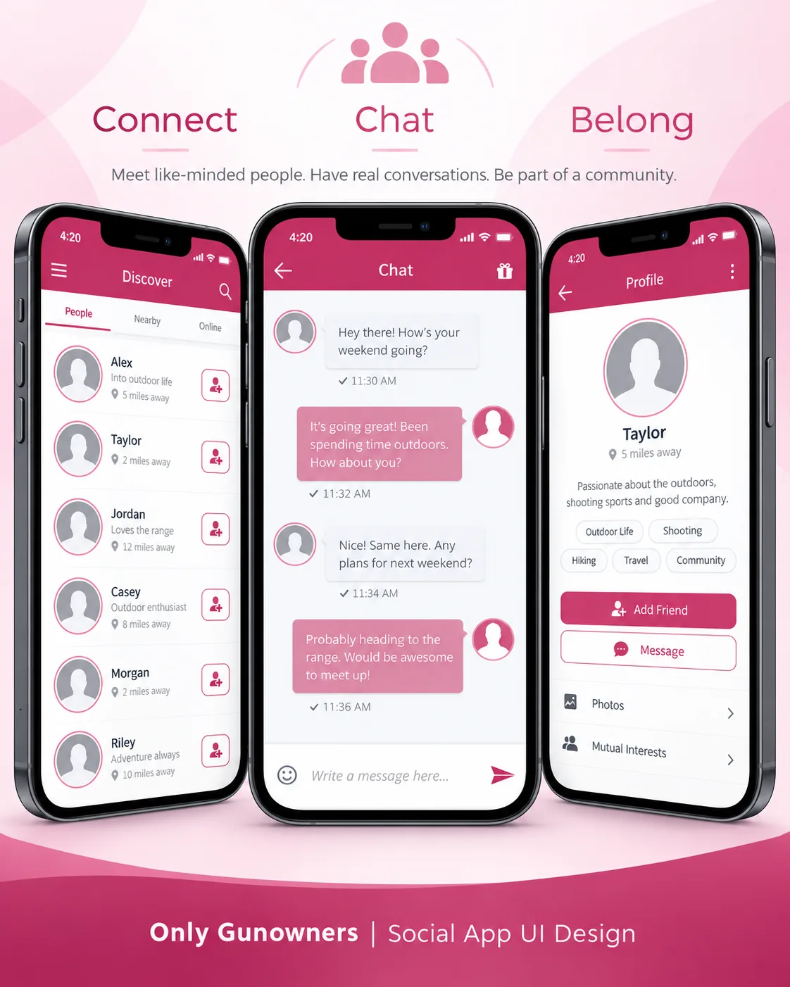
- Let users browse people through a scannable discovery list.
- Make connection actions available without overloading each row.
- Use a focused conversation layout with clear sender states.
- Bring interests, profile details and contact actions together on the member profile.
Design and delivery work
- Member discovery interface
- People, nearby and online filters
- One-to-one chat screen
- Profile and interest presentation
- Add-friend and message actions
- Reusable community UI patterns
Technology and integration scope
The documented scope is a mobile UI concept with reusable discovery, conversation and profile components. Real-time messaging, location services, friend relationships, media storage and production APIs are not claimed.
Screenshot evidence
The approved visual shows three connected interface states: discovery, chat and profile. It demonstrates interaction hierarchy and component consistency, not a deployed messaging or location service.
Qualitative outcome
The screen direction creates a clearer relationship between finding a member, starting a conversation and reviewing profile context while keeping primary actions consistent across the journey.